How We Partnered With Mapbox to Visualize Evictions Nationwide

When Matthew Desmond and his Eviction Lab research team offered us the task of mapping and visualizing their first-of-its-kind database of eviction statistics, we (the web team) were excited, honored, and humbled. And then, when things began to get real and the project took shape, we drew a collective deep breath as we grasped the magnitude of the challenges ahead of us.
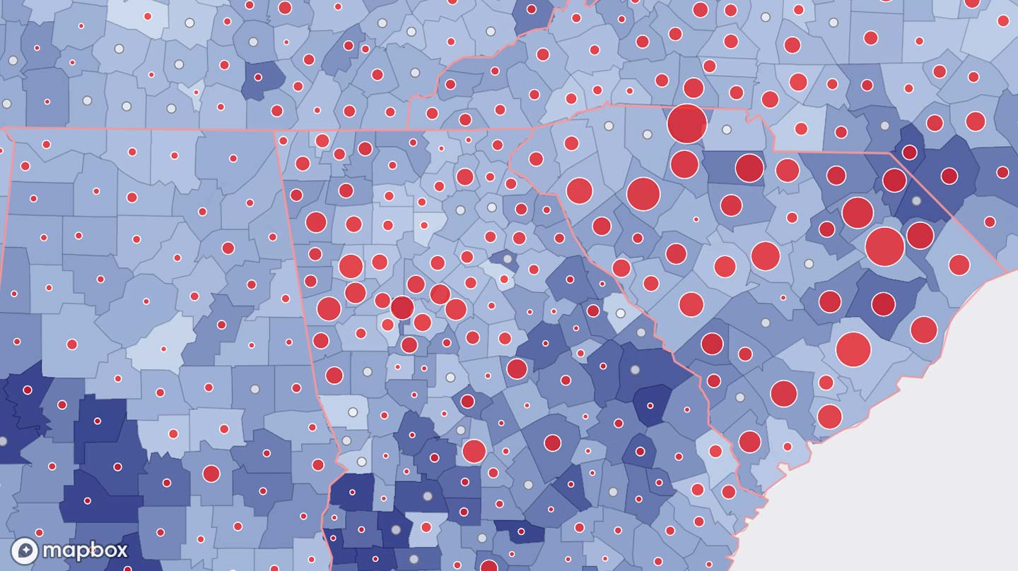
First, for our Map & Data tool, we needed to display eviction rates on a map of the entire country, at scales ranging from US states to Census block groups and everything in between. And not just those statistics, but a long list of Census variables too, making this a bivariate map. We needed geocoding so users could enter addresses and place names to find the locations of their choice. And we needed to be able to load all this data—almost a gigabyte of it, in total—at a speed rapid enough to keep pace with our users’ curiosity. (Oh, and not to mention: have the ability to create custom PDF and Powerpoint reports on the fly!)
In all of the above, we were greatly aided by our partnership with Mapbox and the platform they’ve built. Knowing both the power of their tools and their commitment to public service projects, we reached out and found them very responsive and willing to help us meet our needs.
They also honored us with an interview, where we took a deep dive into our design and technical processes, and offered a preview of things to come. If you’re curious about how our site and tools were built, give it a read!
Read the article: Mapping Nationwide Evictions: How We Built It